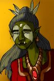
I'm playing Dungeons and Dragons, 4th Ed. with some friends, and figured, I ought to do quick portraits of everyone so we have an idea what we look like. XD
I'm playing a half-orc ranger... but I didn't like how the internet portrays half-orcs so I kinda came up with my own design.
Part Shaak Ti from Starwars, part... lots of other random stuff. (Er, why yes, I am a nerd... how'd you guess? ^_^)
I didn't intend for this to be anything more than just a quick sketch, but I figured I might like to color it for kicks and giggles.
Things I didn't like:
The pencil lines weren't very carefully considered and I didn't ink her again before scanning.
Also, her neck really bugs me. It's just... anatomically not correct? Or maybe I'm being picky.
Her dress wasn't very well colored either. I tend to shut down when I start dealing with fabric, I don't know why.
Things I did like:
Yay for highlights on metal! That turned out better than I had expected.
Her expression came out pleasant rather than angry or creepy, which has been difficult when drawing this character...
Anyway, I know it has nothing to do with the theme but I figure, until we get some more theme stuff, I might as well post the other things I'm doing :)
I like her look because despite she is an org, she still has a feminine quality.
ReplyDeleteQuestion of Neck:
I think whats wrong with her neck is it's too skinny and her head is too far to the left.
Whenever I have an anatomy problem I turn the image backwards (and sometimes upside down) and that usually points it out to me.
I think since this is a quick sketch the coloring and line quality are fine. If this was a rendered piece then obviously they would have to be worked out more.
I think it does it's job well of informing the player of what your character looks like :D.
i could imagine getting her expression would be hard!
ReplyDeleteand i agree with what alina said about the neck being displaced but about the thin-ness, it is anatomically incorrect but if she was part elf im sure the thin-ness would be explainable. ;)
as for the coloring, the shadows on the face are good. (i always have trouble with getting nice contrast.) but i would suggest varying the hardness / softness of your shadow lines and trying some different colors in there as well. like this girl here goes way extreme with her shadow colors http://buuya.deviantart.com/art/June-08-Kate-Austen-125279497 and its a bit out there as far as realistic color palettes, but everything is alot more colorful than we think it is :)
of cores as it was intended to be a just for fun piece its fine.
and i know what you mean about cloth. its just so boring sometimes.
anyways, its good, i like the jewel and her eyes.